Thursday, February 5, 2009

Card for Grams

I just finished a card for my grams. It's just a simple stamped image but then grams isn't much into flashy stuff the way I am.

Sometimes an image just speaks to you. Other times, it's hard to find the right colors. It's always helpful to stamp a copy and test the colors first. I tried several different colors for this as you can see. I knew which basic colors I wanted the flowers, but not specifics. The background was more troubling. I really wanted to a light purple, but Gram hates purple with a firey passion, so no purple.


In the end I settled on the BG05, Holiday Blue. I really like the dark blue personally, but it just wasn't quite right for this piece.

The Spica glitter pens are perfect for adding those little finishing touches. I added some green sparkle to the centers of most of the leaves. Not only did it add oomph, but also darkened that line and added the detail.

I used the PM white paper and then the Zig 2-way glue pen to adhere it to the card front. Mostly cause my gluestick dried up and I haven't gotten to the store.

For the envelope I only inked a corner of the stamp. I tested it on scrap paper to make sure I had enough ink on the stamp, that I wasn't covering too much, too little of the image. Then I went in with the same colors I used on the card. Since the envelope is not marker paper and the colors will bleed through, I tucked a scrap piece of scrap paper in there before I colored.


Read more!

Wednesday, February 4, 2009

Requiem

Class: Book as Art


[EDIT: Someone noted that I sound incredibly depressed if you read the words in this project. Well, it was in reference to a good friend dropping me from her life, so yeah, I was not in the best place. But making this was very cathartic and I worked out some issues.

Also, my professor decided that this one came out rather splendidly, so she's put it in the campus art show. I was pleased.]


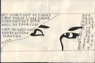
This project started with the teacher asking us to make little books, filling them with song lyrics or a poem. I used the lyrics from "Open your eyes" by Snow Patrol.


These two pics here are the first steps. I printed off an image of a clock and used it for a base, making mine a bit more simple. After inking and erasing the pencil, I colored in using E49, E77, Y06, and Y35.


This first page was all done in rubber stamp. I picked up three of the different small dollar sets of the alphabet from JoAnns. I love these things.


I actually screwed up on this page. I originally wanted the broken heart in the middle, but I accidentally stamped an image in the bottom right that wasn't supposed to go there. I think it turned out well anyway. I drew the image of the broken heart with a .03 multiliner, then filled in with black. This paper was really forgiving, so I went over that with R29. On the other side, I stamped the two N's the wrong way. To make it work, I smudged them and blurred them with colorless blender so now they look more like tear spots than mistakes.


This page is one of my favorites. I actually put the words down first and decided it needed something more. I'd already done the next page, so decided to carry the image back a page into the book. I sketched the eye, leaving room around the words so they were still legible. I used BV29 for the base color of the iris and added in streaks of G07, B29, V15, and R29.


All these words got to be a bit tedious. My teachers only criticism was she couldn't understand the words on the right hand side. I had to explain that they went up and down not left and right. I actually printed off a pic of a friend in black and white and traced the face, then copied it onto the page. I went over it with the .03 multiliner and filled in with the multiliner brush small.


Coloring this page and the next was so much fun. The pics of this in progress you already saw. The purples I used were BV00 and V15. The highlights I went over a few times with the blender and used the light BV00 to blend the V15 along the bottom edge of the shape.


I used the same colors and technique here on the matching figure. The butterfly skull is a stamp I picke up at the Allentown Rubberstamp Fair. (For the life of me I can't find the card, but she was a really lovely woman. Took a picture of my shirt 'cause it would make a great stamp idea. Anyway, thank you.) I used V15, Y35, YR16, YR07, and E07. Oh and C03 or 05 for the skull...


All in all, pretty nice.


Read more!